Which reference photo to choose for an AI portrait?
The reference is the starting point of a creation which must evoke a person. An easy-to-read photo helps more than a heavily edited selfie or a portrait in difficult lighting.
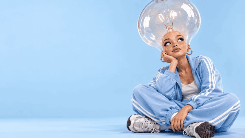
Favor a visible face
Choose a sharp image with a single main subject and a sufficiently large face. Very dark glasses, hair in front of the eyes and filters that reshape features hide useful information. A natural expression then facilitates the comparison between the reference and the result.
Prefer regular light
Soft window light can make volumes readable without harsh shadows. Avoid colored lighting that strongly transforms skin tone if your goal is a natural portrait. The background does not need to be remarkable: it should above all allow the subject to stand out clearly.
Check the selected mode
Not all models work from a photo. In the studio, use a mode advertised as compatible with a reference and respect the file formats indicated. The reference guides the image without guaranteeing an exact copy; re-read the lines and proportions before publishing.
Putting this idea into practice
A full-frontal or slightly three-quarter portrait, with a calm expression and a simple background, is a good starting point. Keep the original so you can check the results without relying solely on your memory.
Before choosing your images
- A clean and clear face.
- An easy to interpret light.
- A photo that you can authorize to be used.
To prepare your series, also consult how the studio works and packages and their total amounts.